Eye Genius, hygienic packaging design for eye drops.
This concept packaging has been designed to provide users with healthy and safer (one time use) eye drops.
Designer : Toby, Zheng
{ Comments on this entry are closed }
Here is a flat pack design that you may find illuminating (ahem)
Designers: Hyun Jin Yoon & Eun Hak Lee
It is the size of a credit card and powered by a small cell.
Flip up the light bulb shaped cut-out to activate, the rest of the card serves as a stand.
Store one in your wallet or purse, you never know when you may need it.
{ Comments on this entry are closed }
A fresh take on an old product:
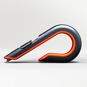
Liquid http://www.liquidagency.com/studies/slice?region=usa has been the brand architect behind the relationship between Slice, a maker of cutting instruments, and some of the world’s most celebrated designers, including Karim Rashid, Michael Graves, and Yves Behar.
Now, Alfredo Muccino has joined this group by collaborating with Scot Herbst. They have co-designed a box cutter that uses ceramic blades.
The cutter uses a Zirconium ceramic blade which apparently lasts ten times longer than traditional metal blades. Whether breaking down boxes for the recycling bin at home or stocking store shelves, the ergonomic wrap-around form protects hands and knuckles from staples and box fragments, tracks smoothly and evenly across the cutting surface, and hooks on a pocket or belt loop for easy accessibility between use.
Credits: Scot Herbst and Alfredo Muccino of Herbst Produkt + Liquid for Slice Inc
Winner 2011 RedDot
Very Tron!
{ Comments on this entry are closed }
Just what the doctor ordered…
…imagine, every member of the household having their own “Apple” embedded with its own personal viewing, control and audio preferences for the TV.
The high-tech bowl they reside in automatically recharges the technological “granny smiths”
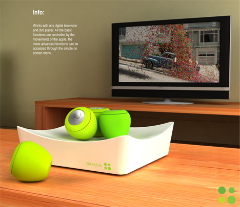 The nature / technology angle is always refreshing, mouth-watering in this case, though I struggle with apples and Sony?
The variations in “ripeness” is a really nice design touch to identify the individual produce for different family members.
Designer: Jason Roebuck
{ Comments on this entry are closed }
| Incorporating distinct designs for unconventional projects, Andreas Wenning and his firm baumraum have become one of the world’s most renowned treehouse architects. Owing to his personal preference for small spaces and experimental architecture, his treehouses represent a symbiosis between modern architecture and nature. Built mostly for families with smaller children, baumraum has built treehouses throughout Europe-Germany, Austria, Italy, Hungary-and as far away as Brazil and the U.S. “We’d be glad to build something in the Middle East. We would like to present other concepts-like Jungle House and Palm Fiction-and maybe parlay that into presenting something for higher-level clients as well,” says Wenning.With so much of the industry’s emphasis on building smart and building green, Wenning understands the challenges of building structures that directly interact with their natural environment. In short, he knows putting buildings in trees isn’t the best way to be eco-friendly and, to that end, baumraum collaborates with experts to ensure the treehouses don’t injure their natural hosts.”We work with tree experts to find the best solution to connect the treehouse with the trees. We use textile belts and heavy duty steel cables to fix the structures. We don’t use any bolts or nails.” |
Palm-fiction renderings : Cristina Caldieri and Andrea Cigolini:
I imagine that the windows automatically solarize to cut down glare? What a great environment for a tropical break!
I wonder how it does in a tropical storm…could be a sleepless night.
Dramamine?
{ Comments on this entry are closed }
This wall-wine sconce from Iron design company: http://www.irondesigncompany.com/products/kitchen/wine-sconce.html
holds up to a half case, the fluid shape of this wine rack appears to be molded by the wine bottles themselves…Perfect for the contemporary home or apartment. I would imagine this design would force you to keep it fully stocked!
{ Comments on this entry are closed }

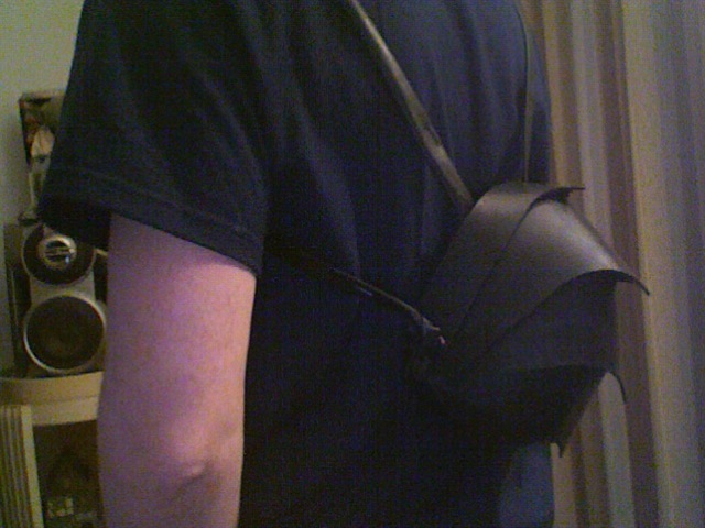
Witness the Pangolin, an aggressive looking backpack by Cyclus http://www.cyclus-us.com/.
Handmade with recycled truck tire inner tubes the bag’s form takes its’ inspiration from the protective scales on the back of an animal called the pangolin, a nocturnal creature from the tropical regions of Africa and Asia.

The bag articulates via stylish chromed pivots…(tap heads)! and it incorporates a headphone outlet grommet.
This handcrafted backpack is made by people from Colombia with a social disadvantage, such as single mothers, refugees and Indians of the Camentsa tribe, proceeds are going to a good cause which is a good thing considering the bag has a hefty tag of $290.
Great concept but I would imagine the product may be a little larger and heavier than most people are accustomed to.
 I did notice that these issues are already being addressed in some “build your own” websites.
{ Comments on this entry are closed }
Spa footwear by designer: Ondřej Václavík.
After the massage table strut proudly to the sauna in style in these therapeutic and minimalist sandals.
Vibrant colors and the innovative use of materials and patterns mask the ergonomic dynamics of these slippers on wet floors. The shapes, holes and cuts also maximize the therapeutic purpose of massaging and stimulating your feet while you walk in them.
This line of foot apparel has been adopted in the Imperial SPA Hotel in Karlovy Vary.
Oh, and the packaging design is quite fresh as well:
{ Comments on this entry are closed }
It has been one of those serendipitous weeks where one product has come at me from all different angles, in this instance the ubiquitous guitar. First I made contact on Facebook with an old college friend and read about his new guitar design and build venture in the UK:
http://www.rawguitars.net/index.html
Then I was contacted by a young entrepreneur from NYU, Rafael Atijas, with a really unique and very creative idea,
http://loogguitars.com/kickstarter/index.html
His creative web campaign to generate seed funding to strike the first major chord into the chorus of mass producing the idea is brilliant.
In the designers own words:
Hello there! Thanks for stopping by. With your help, we would like to launch a line of customizable, 3-string guitars, to be built by children with their parents.
The Loog Guitar, that’s how we call it, is not a toy. It is a real guitar, made out of real wood, that tunes, plays and sounds amazing. But its not just a downsized-replica of a regular guitar; the difference is that it has been designed from scratch with a child’s needs, comfort and safety in mind, from the fun shapes, the rounded corners, and our signature feature: the 3 strings.
So, why 3 strings?
We love 6-string guitars, but we believe that they can be overwhelming for little kids and beginners. The Loog Guitar, with its 3 strings, makes it easier for kids to tune, play and listen to the notes they are playing. It is a more stimulating experience that allows children to play music right from the start.
We also believe that building a guitar is an essential part of understanding and loving the instrument. When you build your own guitar you develop a deep connection with it, and that is why we will ship The Loog Guitar unassembled for parents and children to build at home.
The guitar that grows with your child
The Loog Guitar is not only fun and easy, it is also convenient. You can start with the short-scale model, recommended for kids ages 6 to 9, and when the little player grows, you can replace the neck of the guitar without the need to buy a whole new instrument. Just swap the old short-scale neck for the new long-scale neck and you are ready to go.
In fact, every part in The Loog Guitar is interchangeable and compatible will all models. In this way, you can get the triangular-shaped guitar, and if you feel like changing to the rectangular guitar, you can just buy the body, easily attach it and have a brand new looking guitar without the cost of a whole new instrument.
Why Kickstarter. Why $15,000.
Taking this idea to market is a long, expensive process. Way more expensive than $15,000, in fact. Fortunately, we have been able to raise the necessary funds to cover our pre-production expenses. We were recently awarded a grant from Uruguay’s (my home country) Innovation Agency that covered 50% of our R&D costs, and that made it possible for us to reach this stage, after a whole year of countless design iterations, prototypes and testing.
We are now ready to move into production and for that we need to go through an expensive process that involves building molds, buying materials, using CNC machining, and other fun stuff. We need $15,000 in order to produce a first run of guitars that can be ready to ship as soon as the Kickstarter campaign is over.
So that’s why we are here and that is why we need your help. If you think this is a cool project and you would like these guitars come to real life, we can make it together. There are some cool rewards for you too, including the chance to pre-order a Loog Guitar at a special discount price, and get one of these guitars before anyone else.
So that’s pretty much it. Thanks again for stopping by and please let us know what you think of The Loog Guitar.
Cheers!
Rafa.
I wish you every success with this venture Rafael.
{ Comments on this entry are closed }
…And completely on the other end of the spectrum from the ubiquitous porta-potty:
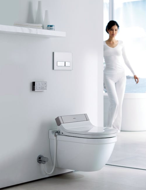
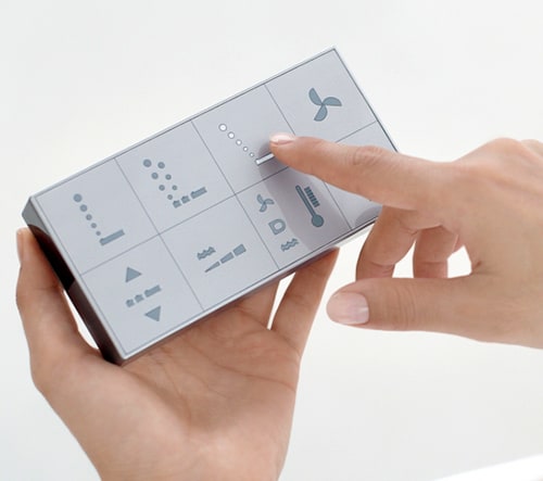
I give you Philippe Starck’s SensoWash Starck 3 – a new shower-toilet seat that combines contemporary aesthetics, comfort, convenience and cleanliness. The heated seat brings a little luxury to an otherwise unglamorous, utilitarian necessity. A hand-held remote control lets you conveniently operate the seat’s many functions – Rearwash, Comfortwash, Ladywash, the hot-air dryer, seat heating, and even the memory keys programmable for two different users…the sheer luxury.
New for 2011, the SensoWash Starck 3 shower-toilet seat can be combined with any toilet from the Starck 3, Starck 2 and the Darling New ranges.
Talking of luxury…
{ Comments on this entry are closed }
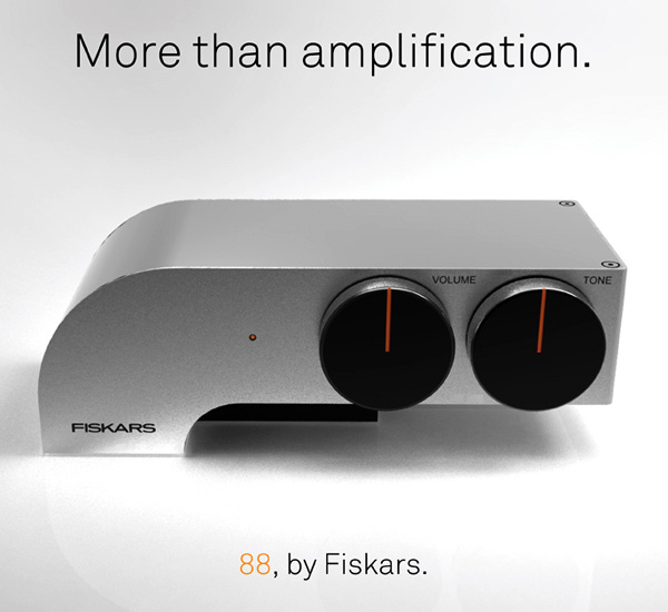
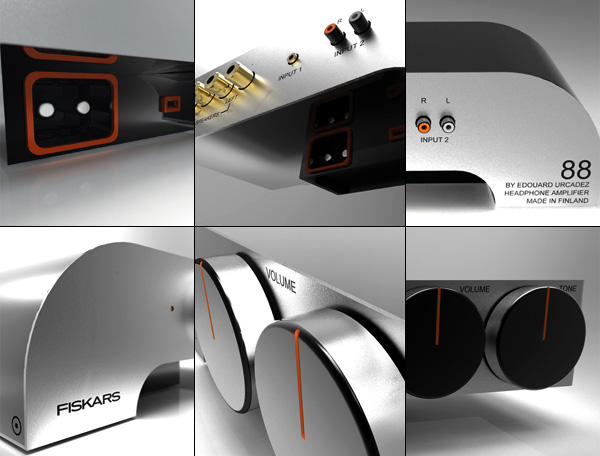
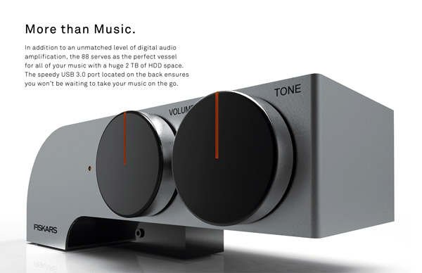
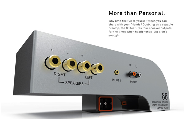
 What if Sony made cars, Apple made dishwashers and Google made furniture? This poses a unique opportunity for a designer to take a company’s brand identity and apply it to a market they don’t currently serve. Designer Edouard Urcadez took the Fiskars brand aesthetic (known for shears and garden tools) and translated it into a HDD headphone amplifier called the “88.”
It’s minimal but with just enough exaggeration to easily be identified as a Fiskars product. The 88 stores music on its HDD but also connects up to four speakers if headphones aren’t your thing.
Designer: Edouard Urcadez
Interesting brand and form exercise. I just know I would use that flat top surface as a storage place for my pruners.
{ Comments on this entry are closed }
Portable restrooms are small. They’re disgusting. They smell and they’re scary.
“Oh that is ridiculous”
And they’ve even been described as a “portal into the depths of hell.”
University of Cincinnati College of Design, Architecture, Art and Planning 2010 graduate Carly Hagins decided to change the perception of portable restrooms as part of her industrial design senior capstone project by redesigning today’s portable john.
“The idea is really important. It’s kind of hard to come up with a good idea,” Hagins said. “My mom said, ‘You know, you’ve always been interested in bathrooms. Why don’t you [do your project on] a portable toilet?’ “
Once the idea hit the table, it made sense – because nobody likes them at all.
Here is how it works:
The Complete portable restroom provides a better experience for the user, a more profitable venture for the business owner, and a more environmentally friendly option than other portable restrooms. It is a comprehensive solution for the portable restroom industry that strives to address the ‘triple bottom line’ (people/planet/profit.)
Complete’s waste tank is located beneath the floor of the restroom instead of under a bench-style seat. This opens up more room within the restroom, resulting in a more comfortable user experience.
Sawdust is dumped into the tank after each use of the restroom. The sawdust primes the waste for composting and minimizes odor within the restroom. Periodically, the waste and sawdust are pumped out of the tank and transported to a municipal composting facility. At the composting facility, the waste can be processed and will eventually yield healthy, sterile, fertile planting soil. (For more information on this process: http://humanurehandbook.com/)
Complete is designed with the same footprint as current portable restrooms. This makes it possible to retrofit existing restrooms with the ‘guts’ of Complete- installing the composting toilet while still using the old walls.
Composting toilets are completely odor-free, which would be an improvement from the pungent smell of current portable restrooms. By providing a better portable restroom experience, Complete would be a public health asset. People wouldn’t have to ‘hold it’ just to avoid using a portable restroom.
A new restroom that is both environmentally and user friendly would give businesses an edge when competing for customers. The possibility of being able to sell the compost, instead of paying to dump at a waste-water facility, would also provide a second source of income.
So, what does the redesign look like?
“I think design becomes the most powerful when it tackles hard issues,” Hagins said. “Sanitation is a hard issue. People are uncomfortable when it comes to talking about bathrooms and what goes on there. It’s a reality of daily life, though, and shouldn’t be overlooked. To me, a well-thought out toilet is in many ways more impressive than a beautiful lounge chair.”
Significantly more impressive Carly and it has a much more important “purpose”! You are well on the way to making festivals fun once again, and congratulations on your well-deserved prize last year.
{ Comments on this entry are closed }

Sex objects don’t look like themselves anymore. While the industry of personal sexual satisfaction is still dominated by glittery phalli and plastic rabbits, a handful of companies that challenge the anatomical form factor have started to emerge. And San Francisco-based Jimmyjane has been one of the driving forces behind this new design of delight.
Launched in 2004, the company first gained attention from the design world when founder and ex-industrial engineer Ethan Imboden teamed up with the renowned Yves Béhar (whose firm fuseproject designed the OLPC, among other things). The pair’s first collaboration was the Form 6, the first of the FORM series. (The most recent is the FORM 3, following the FORM 2 — confused?) Then Jimmyjane went on to collaborate with artists such as Jamie Hewlett of Gorillaz and The Eurythmics’ Dave Stewart on special editions, picking up design accolades like the IDEO and I.D. awards along the way. The company has almost singlehandedly paved the way for a new sex toy paradigm — high design that’s sexy, utilitarian, and accessible to the mass market.
by Leila Brillson


{ Comments on this entry are closed }
Bamboo is a plant that is quickly replenished, making it a sustainable choice for construction.
it also has a high mechanical strength and durability to weather conditions.
Choosing to use the material in its natural and raw form, Israeli designer Gal Ben-Arav has developed
the ‘bamboo bench’. He has done so in wanting to maintain the materialism, simplicity
and natural morphology of the quickly growing species, while on the other hand,
creating a conflict and tension between it and industry – aluminum casting.
The seating unit can be formed using two different bench typologies: with or without a back.
two cast aluminum frames, reflecting the silhouette of a chair or stool form the structural support of the bench.
Raw pieces of bamboo fill the frames, acting as both the seat and back of the furniture object.
the frames can be adjusted along the length of the bamboo used according to structural needs
and weight limits.
What a great use for bamboo in all those areas in Austin Texas where this aggressive grass has taken over, this could be a new “standard” park bench. I assume the bamboo would need to be replaced every so often?
Even better!

{ Comments on this entry are closed }
CTRUS. Is a football (as in soccer) ball that doesn’t use air but an inner elastic structure and an elastomer skin that perfectly simulates a real football ball. This ball is designed to visually display it’s status, a system that would avoid most referee mistakes.
Many people argue that one of the beauties of soccer is the occasional mistakes made by referees, but when it’s your team that gets eliminated from a World Cup or the UEFA Champions League because of one of those mistakes, it may cost your club millions of dollars.
The CTRUS C1 avoids these mistakes thanks to an internal positioning system that would keep track of the ball at all times. The ball will also change color depending on its position and the game situation (like getting red during a dangerous free kick).
To all the soccer players out there…I am just the messenger!
Intriguing idea on the construction and ruling front, not sure about the illumination aspects…surely this would be a little distracting for the players?
Is he reprogramming the ball (mid air), to remain green?
{ Comments on this entry are closed }
Okay, Okay, I know I promised to not to feature any more superyachts, but this is one yacht with a difference, you guessed it…it also goes underwater!
 Italian designers Marina Colombo and Sebastian Vida have unveiled the 66.5 meter ‘Undersea Yacht U-101’ concept, conceived as the first superyacht to combine underwater exploration with all the comfort and style of a modern superyacht.
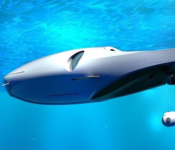 The luxurious U-010 Underwater Yacht concept is an extraordinary vessel able to operate like a Superyacht and a submarine to explore the width and the depths of the ocean in style. With an overall length of 220 feet (67 meters), the U-010 vessel was designed for deep sea exploration combined with comfort and luxury. The yacht can travel on the surface as well as underwater by cleverly passing from diesel to electric propulsion.
The U-010 superyacht concept is fully equipped with integrated stabilization systems to make any cruise, above or below water, as comfortable as possible. The underwater motor yacht holds a contemporary exterior design alongside an ultra-modern interior.
Like many of the commercially viable private submarines designed to accompany superyachts, the U-010 underwater yacht is designed to offer an unforgettable underwater experience.
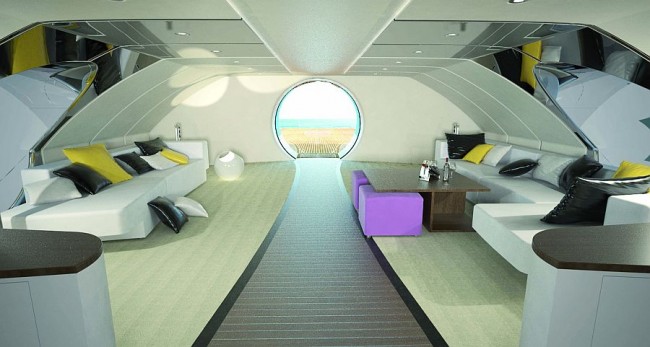
The new luxury submersible yacht will be equipped with a relaxation parlor, sauna, lounge bar and vast spiral staircase. The interior of the yacht would cover a surface area of more than 700 square meters.
A room with a view.
 The construction of this pleasure submarine poses a lot of engineering challenges, as it should be built of composites, carbon fiber and aerospace alloys, which will involve enormous cost.
Hmm, perhaps next Christmas?
{ Comments on this entry are closed }
Nicolas Hubert, a French industrial design student studying in China, used his everyday experience of living in Shanghai to respond to the challenge of this year’s Electrolux Design Lab, specifically finding efficient ways of maximizing space at home. Here we take a closer look at the benefits of the ‘External Refrigerator’.
Background:
Two years in China provided the inspiration for Nicolas Hubert’s external refrigerator. Fixed directly on the outside wall of residential buildings, the concept is an elaboration on a way of life in northern China where food is kept on balconies in the winter to save space and energy. During cold seasons and at night, the low external temperatures are used to provide the right climate for items in the fridge. During warmer weather, the sun is used to transform light into energy through solar panels. Nicolas reflects Electrolux design values: the shape and finish are kept pure and simple so as to ensure easy integration with the external urban environment, whilst a range of colors and ambient lighting facilitate this further still.
What was the inspiration for your concept? I draw my inspiration from my everyday life in China. I’ve been living in China for 2 years and I still discover some fascinating aspects of their culture and way of living. Observing their behaviors and habits, I tried to focus on how they deal with small spaces. In big cities like Shanghai, space is a luxury so people find ways to make those small apartments bigger using for example the outside as part of their own space.
How does your concept fit into the theme of compact living?
My concept gives clues on how to avoid the constraints of limited space in future apartments. My project involves a new concept: The use of an unexploited area, the outside. It provides for the inside a greater space to organize furniture and to enjoy home activities.
Why would someone want your concept (what are its main benefits)?
Mainly because my concept increases inside home space for the consumer activities. Secondly, this solution will help the consumer save energy and money by reducing the electric consumption thanks to the re-use of the outside low temperature during winter and the collect of sun energy during the summer.
Beyond the space saving benefit, this concept permits to combine both refrigerator and air conditioning system at home.
Describe the consumer research behind your concept?
I went on the field and focused my project research locally on the food storage habits of Chinese consumers. I observed and analyzed this behavior in the north of China, where during the cold season they take advantage of the outside low temperature to keep the food fresh on their balcony. This permits to unplug their fridge in winter, save money and by extension energy.
What kind of materials would you use to build your concept?
The development of my concept keeps the same main materials used for the current refrigerators, like ABS high quality for the inside body. I chose Polycarbonate plastic for the external cover shape, which allows lightning effect. To control the refrigerator and receive information from the device, a capacitive-sensing touch screen area would be perfectly integrated on the door. On the top part of the refrigerator, a solar panel is added. Considering recent advance in this technology we can hope to reach an efficiency of 25% in coming years. To protect the refrigerator from sun heat, a combination of air layer and dense polystyrene material would efficiently insulate the device in summer season.
I wonder if the designer considered mounting it end-on with a bracket, so the pull-out refrigeration section would be ejected inside the apartment interior? This would eliminate the need for a window or door to be opened for unit access and any undesirable icy blasts into the home interior.
I love this fresh idea (ahem) and it totally hit a personal chord…(plastic bags hung from a tower block window being my first ever “refrigerator”)! Brrr, – great energy and space-saving concept Nicolas and congratulations on being a finalist in this prestigious competition.
Here is a video from the competition which highlights products that may present permeation’s of themselves in our near future…
{ Comments on this entry are closed }
Tired of temperamental and bulky plastic book-lights that seem to have a lifespan of only a couple of weeks? I know I am, I have worked my way through all their designs and battery changing nonsense and inherent “ergonomic” touted flaws!
I am happy to announce that there is future hope to our dim-lit-reading plight, thin as a page of a book, it is an elegant product to enlighten dark rooms and tents, this concept takes reading in low light levels to an obvious conclusion. I present the bookmarking Lightleaf by: Valentina Trimani
I assume induction is the recharge mechanism of choice here?
A superb, innovative and elegant design solution to an old reading problem!
“Great progress is being made in the field of light displays such as OLED, and even if not quite ready to affect our daily lives, they are giving a new freedom to designers who are called upon to imagine future applications and new, inspirational archetypes. This project finds its home in this panorama of international research, mapping the wishes of consumers and pursuing innovative options and solutions to meet their desires”.
Valentina Trimani
{ Comments on this entry are closed }
Physicist and self titled Kinetic Sculptor Theo Jansen creates stunning intricate wind powered “creatures” mecha – that move on the wind and seem to have a life of their own. Since 1990 Theo Jansen has been occupied with the making of a new nature, not pollen or seeds but plastic yellow tubes are used as the base construction material of this new nature. Eventually he wants to put these animals out in herds on the beaches, so they will live their own lives, perhaps at some future point they will recognize waste and dispose of it?
He builds large works which resemble skeletons of animals which are able to walk using the wind on the beaches of the Netherlands…perhaps he is a visionary to new breeds of products that lurk but on the fringes of our current imaginations? Imagine what concepts he could conceptualize for harnessing the power of solar winds as a potential future propulsion system?
“Aye…He would be good at that!”
{ Comments on this entry are closed }
“Ring is a vibrating alarm designed for people who hate the loud blaring sounds of a typical alarm. The charging cradle is where you set what time you want each ring to go off. The ring fits over the tip of your finger and when that opportune time arrives, it vibrates. Putting the ring back on the dock shuts off the alarm.
The benefits are two-fold. It’s perfect for couples whom wake up at different hours. Never again will you be disturbed from your precious sleep when the alarm goes off. It’s a discrete sensation that only you feel. Another application is for the hearing impaired helping to improve their quality of life”.
Designer: Meng Fandi


{ Comments on this entry are closed }
This fascinating concept comes from a graduate student project at the Bartlett School of Architecture in London several years ago, entitled : Growing a Hidden Architecture. Christian Kerrigan proposed an awe-inspiring series of contraptions: collars, tourniquets, hinges, corsets, and belts that could be attached to still-growing trees, thus bending and shaping their growth into a functioning, sea-ready ship. Christian Kerrigan investigates how man’s ability to control his surroundings is intimately linked with his advancing capabilities of using technology. Christian says “We have reached a point in our evolution where we are now capable of creating design criteria to manipulate natural growth and development.” Here are a some inspiring drawings he produced to visualize his concept.
All images are from “Growing A Hidden Architecture” by Christian Kerrigan
 Copse View: as the trees slowly evolve the ‘Amber clock’ strapped to the tree registers the passing of time with a two hundred year hourglass.
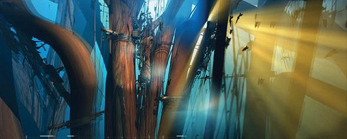 “By controlling the manipulation of refined armatures, calibrating devices and designed corsets,” Kerrigan writes, “the system is capable of controlling the growth of a ship inside the forest. The ship will grow over a period of 200 years and will exist as a hidden architecture inside the trees. The ship growing in the forest is the ship from the ‘Rime of the Ancient Mariner,’ a tale of man’s relationship to mortality.” In a particularly fantastic detail, “the artificial system harvests resin from the trees to measure time passing”:
Slowly growing to completion, the end of the system within the forest is signaled by the Amber Clock, the resin cycles in the trees keeping time. The armatures alter the geometries of the copse with technologies, which are spliced into the hull of the ship.
 Macresco: The corset strapped around the tree creates the formwork for the extruded hull section
The ship growing in the forest is the ship from the ‘Rime of the Ancient Mariner’, a tale of man’s relationship to mortality. For the evolution to last without human intervention, the artificial system harvests resin from the trees to measure time passing. The hourglass is designed to a volume of two hundred years, as the resin passes from the tree the clock slowly fills. Ultimately the hourglass volume is filled, jamming the clock signally the completion of the system. The project demonstrates by creating this architecture within the trees the artificial system itself extends new possibilities into the relationship between technology and nature.
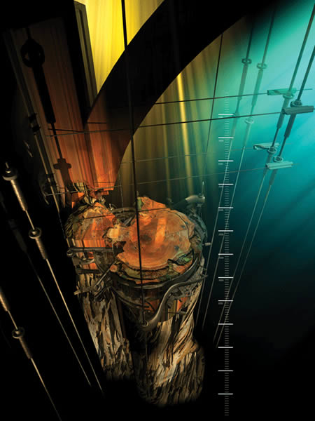 Tree evolution: As the forest matures the ‘Amber clock’ is consumed with the body of the trees. It acts as an artifact for the artificial system of manipulation.
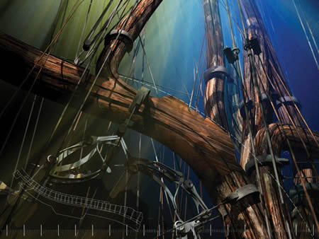 Hull section: As the trees grow the manipulation of the hull section evolves as a trained section inside the tree.
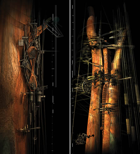 Amber Clock (left): The hourglass is deigned to a volume of two hundred year time span, as the resin passes from the tree the clock slowly fills. Ultimately the hourglass volume is filled and the clock stops signally the completion of the system. Ships Figurehead (right): This the carved ornamental and painted figure erected on the bow of ships. In this system it evolves from the splitting of the tree as an iconographic piece of a symbiotic relationship between nature and technology.
Kerrigan’s vision of a ship self-assembling through carefully restricted tree growth really captures the imagination.
Here is another project with similar (Ahem) roots…
Growth Assembly…
Growth Assembly – Alexandra Daisy Ginsberg & Sascha Pohflepp from Sascha Pohflepp on Vimeo.
This project by artist Sascha Pohflepp examines a similar idea to Kerrigan’s, but it includes the added caveat of gene-splicing…proposing that “modified” plants that could sprout machine-parts instead of conventional fruit and nuts to act as components to build “things”, like the featured herbicide sprayer.
{ Comments on this entry are closed }
HoMedics, Inc. and TEAMS Design developed a unique new paper shredder for HoMedics’ Black & Decker line
“Among the shredder concepts rendered by industrial designer Joseph Lee, one had a minimal and sleek form that was clearly unlike any shredder on the market. The design was intended to transform the appliance into a piece that can become a sculptural element in the user’s home and office decor.
The tall, tapering iShred is the first paper shredder with a vertically oriented paper feed. This feature is designed to increase safety by limiting direct access to the shredder’s blades; the design also allows for the shredders slimmer, conical form.
The design team sought to shake up the “dreary image” of a typical shredder, which it views as a utilitarian device lacking in aesthetics and ergonomics.
“Consumers expect a black or beige box that they have to shove under a desk,” said Lee, “We updated not only the shredder’s styling, but also the user’s experience operating it.”
The design team also addressed the ease of use when emptying the shredder bin. The bin’s round shape was developed as a solution to the uneven pile of shreds that often form in rectangular shredder bins; the shreds instead fall into a naturally even pile, filling the bin efficiently. With the aid of an integrated handle, the shredder lifts off of the 1.5-gallon paper bin. The fluted bin directs the paper shreds in a narrow and controlled flow to help avoid messy emptying.
The iShred crosscuts up to six sheets of paper simultaneously into confetti-sized pieces. It is engineered with overheating protection, a full bin indicator, a 68 dB noise level, and credit card and staple shredding”.
{ Comments on this entry are closed }
Here are some very fresh looking graphic and packaging / brand creations from the New Zealand based…

pHd3 created a brand to instill confidence in the lead substitute product, both to trade and end users.
The scope of the project extended to applicator, dispensing bottle, packaging, labeling, point of sale and support material, all deploying the distinctive Valvemaster orange.
“To me the greatest challenge was to cut through the ‘noise’ in the retail environment.
I believe we have been very successful in achieving this demanding goal.”
Lloyd Williams, Director.
Merlin required a new brand identity to better fit with its range of products, most particularly the remote controllers designed by pHd3. The brand had to work across a variety of applications and clearly differentiate Merlin in both domestic and export markets.
The vibrant green remote control ‘finger on the button’ is a potent symbol for Merlin.
Albedo vfx, a visual effects company in Auckland, planned to increase their international profile and differentiate themselves from their competitors.
The Albedo vfx mark has a dynamic, animated quality, suggesting that the letters are in the process of being ‘animated’. The saturated blue is borrowed from the ‘blue screen’ (part of the visual effects toolkit). A dragon acts as a supporting mark, hinting at the mysterious and fantastical nature of the visual effects world.
More of this groups work at:
http://www.phd3.co.nz/index.html
dragon lake, siberia.
{ Comments on this entry are closed }
This baby bathtub is designed by Teddy Lu.
TubTub is not your ordinary baby bathtub, its functions will grow with your child. This tub has 2 sides to accommodates different size babies from newborns to 6 months old. As the child outgrows the tub, parent could use TubTub as a seat or a stool while bathing the child. This product can also be used as storage to keep bath toys.
I love the multifunctional use / user scenarios…so simple, so effective.

{ Comments on this entry are closed }
Yes, your eyes are playing tricks on you. What looks like a mythical treasure one would stumble upon in a storybook tale, is in fact a beautiful eco-friendly combination of reclaimed wood and LED lights. Great Mushrooming is taking inspiration from the world’s best designer, Mother Nature, to create these luminous mushrooms whose only magic lies in their ability to charm.
Exhibited at the Design Festa 2010, these little scenes are fully handcrafted from glass, discarded wood and LED lights, the fungi’s precise details are cheekily offset by the analog plastic on/off dial affixed to the side of each lamp.
http://www.geocities.jp/youkeepon/
{ Comments on this entry are closed }
Korean designer, chul an kwak’s dynamic tables…
The ‘r.n.i.’ series of tables by Chul An Kwak is inspired by images of running horses. Sculpted from wood, these designs offer the same sort of flat surface you’d see in a conventional table but with legs that seem kinetic and alive.
Here is another piece of furniture design that does not lack movement…
The Gravity Lounger by Varier Furniture has a rather unconventional design, but it certainly looks comfortable. The makers claim that sitting in this chair is “probably the closest you’ll ever get to zero gravity”, reclining to the point where you feel almost weightless. It can also be positioned upright to work at a desk.
Ingenious! I have to get one of these!
All material © 2010 for leveridgedesign.com: unauthorized reproduction strictly prohibited.
{ Comments on this entry are closed }